


I came back to Wieden + Kennedy London after a short break, my dear friend Michael Russoff had called me because they were going to pitch The Guardian Newspaper account. I'd spent some of my best design days working with Mark Porter there and his recent redesign for The Berliner was absolutely stunning.
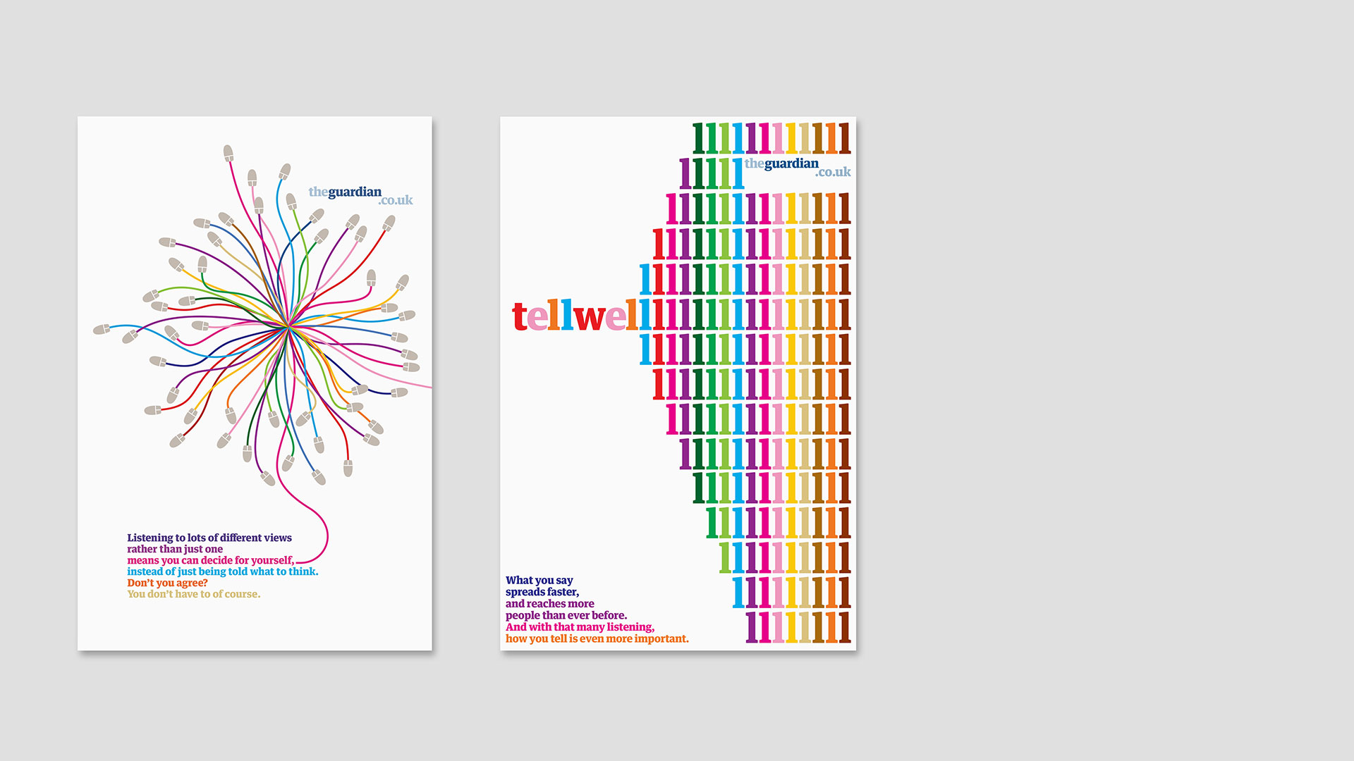
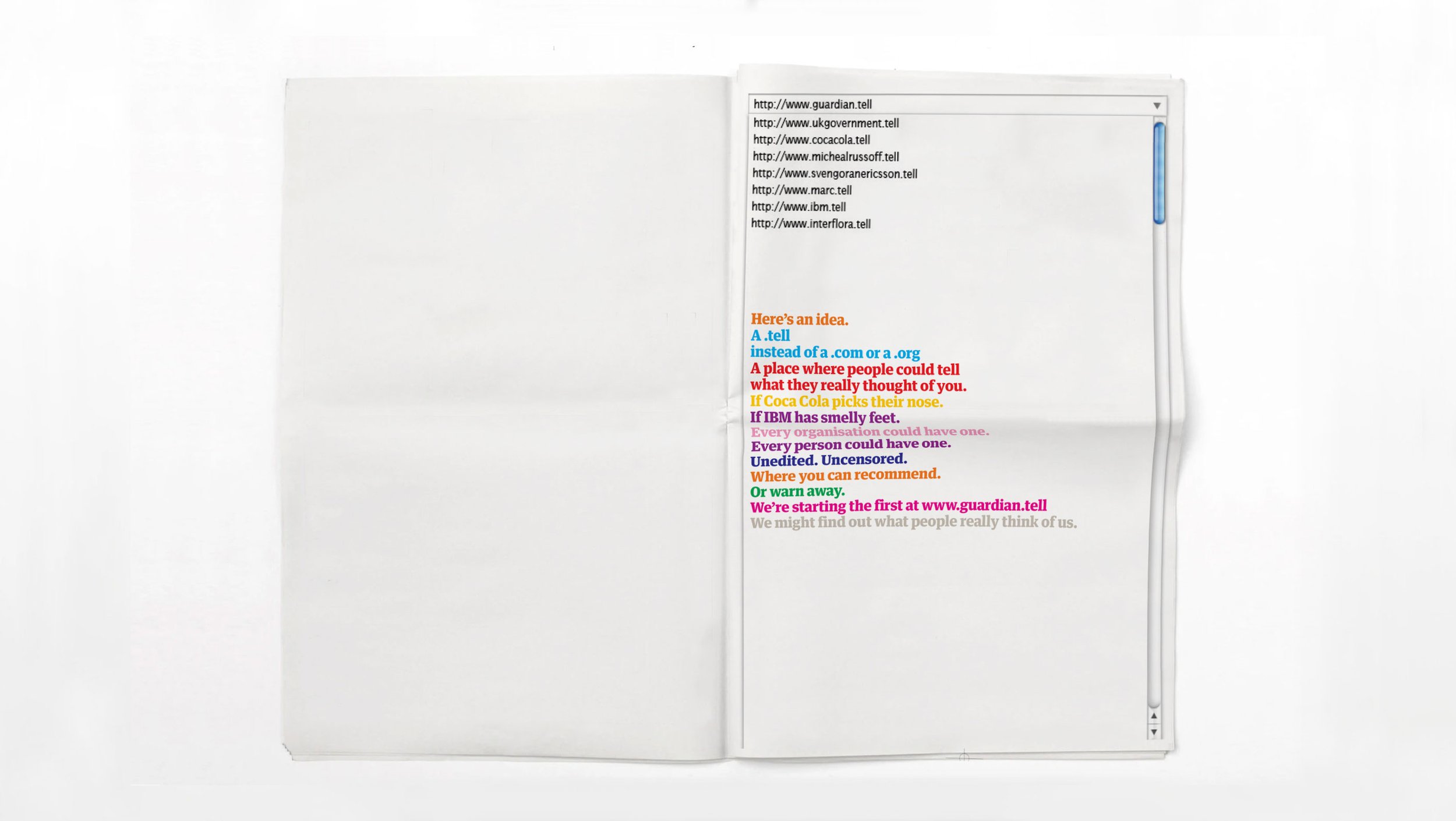
Our first day working on the pitch Michael said, "let’s not make advertising for The Guardian, let’s just take the newspaper for a walk'. It was simple, emotionally smart and it was genius, The Guardian was known for its integrity and traditional 'advertising' seemed somehow wrong. Taking the integrity of the newspaper out of the newspaper and into the world was the idea.
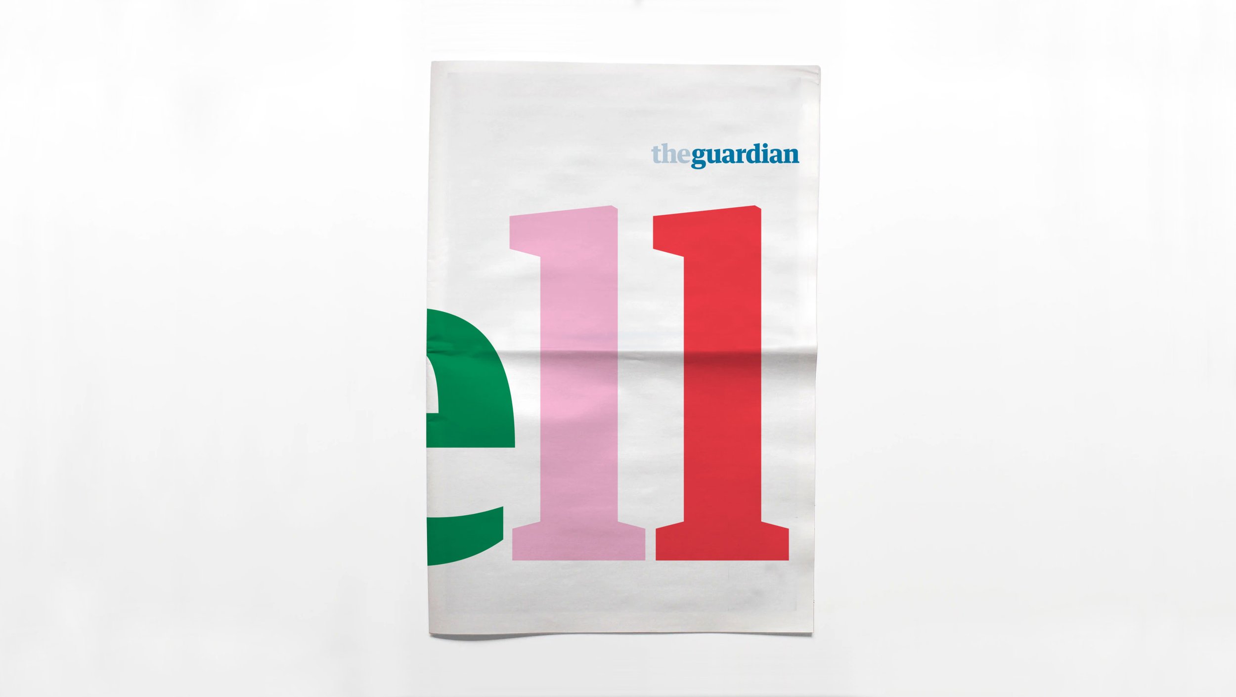
We presented the pitch, about the importance of telling well, and how it should be a skill shared and coveted by everyone. Telling well and understanding the importance of journalism was everything The Guardian cared about. And most importantly for me it matched the integrity that I remembered when working with Alan Rusbridger and his team.
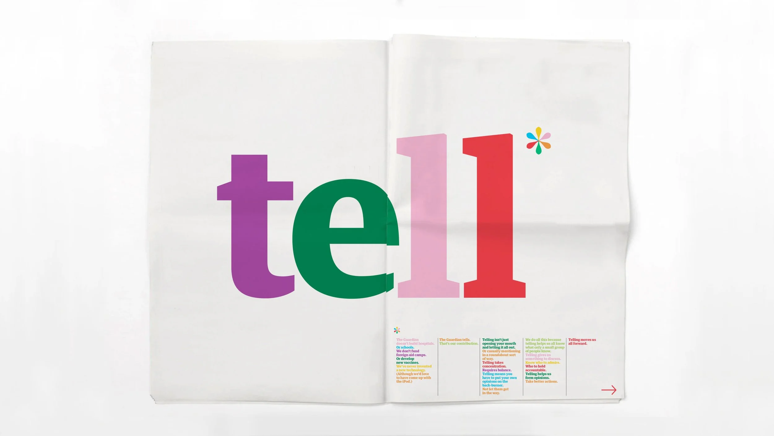
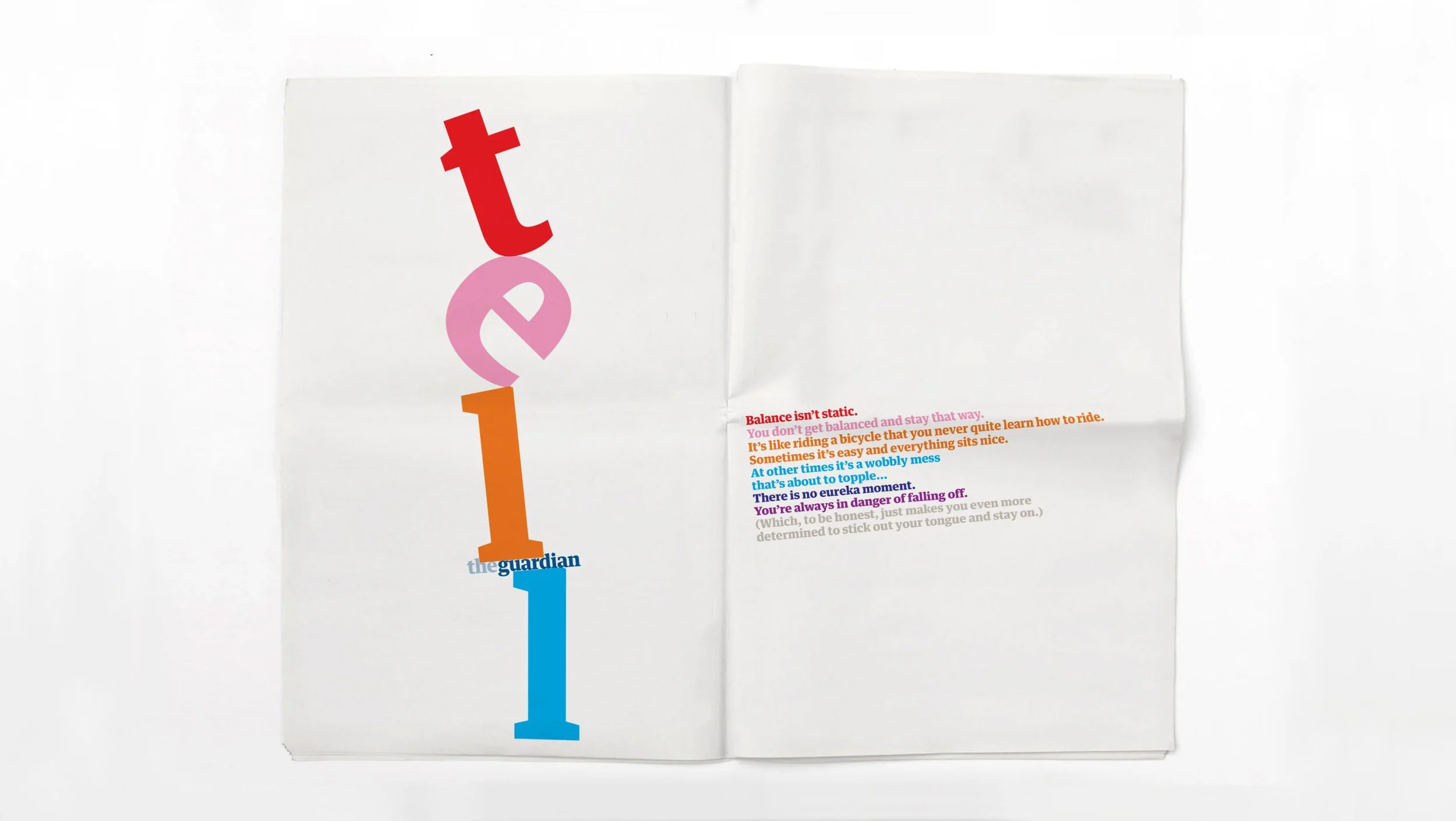
After we won the pitch, we had to sustain the intensity to create work. I called Mark Porter and asked if I could use the new Guardian Typeface he'd designed with Paul Barnes & Christian Schwartz at Commercial Type for the Berliner –https://commercialtype.com/catalog/guardian_egyptian.
Mark and I agreed that the advertising would only use the boldest weight so as to separate the work from the editorial language and subtlety of the newspaper. I made a leap that we could use the extended color palette that Mark had created for the sections to express the openness and egalitarian values the newspaper upheld.
The joy of getting to work with The Guardian team again inspired me. When I'd worked on the Broad Sheet, all the advertising pages were blank, we had no idea what would be there. This time I was working on the blank pages. It was the first time I got to design the product and design the communication – this would be something that I've decided to do throughout my career.
Creating communication which matched the newspaper’s quality was hard and seemed impossible at times. We must have made 200-300 posters and shared as many lines. Michael began to master the guardian tone, it was like watching a musician learning a symphony. The lines began to inspire the image making. And a perfect moment for image type combination slowly formed.
Team
Marc Shillum – Design & Creative Direction
Michael Russoff – Writing & Creative Direction
Sophie Bodoh – Writing & Design
Ian Perkins – Design
Tony Davidson – Executive Creative Director